


Biggest Loser Breakfast Sausage
Season and prepare ground pork for a healthier option for this breakfast staple.
 Slideshows
A History of Nutrition in Images
Slideshows
A History of Nutrition in Images
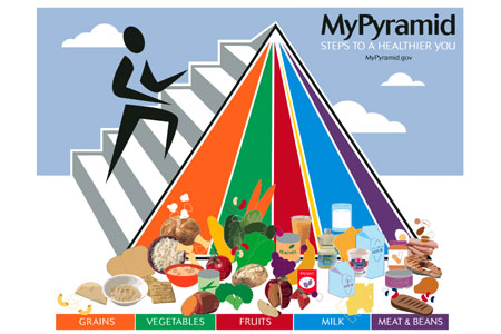
In 2005, the USDA updated the food pyramid with a more abstract image, called MyPyramid. MyPyramid focused on five main food groups, represented by vertical bars reaching towards the top of the triangle, and a slim sixth band representing oils. The addition of a figure climbing MyPyramid was intended to emphasize the importance of physical activity.
MyPyramid was often shown without the inclusion of the foods at the base shown here. Some criticized the image for being too complex, and for trying to convey concepts that were too abstract. For example, having all the bands reaching from top to bottom was intended to represent the importance of having variety in your diet, while the fact that the bands narrowed at the top was intended to represent portion control.
Source: MyPyramid Getting Started. Image via Wikipedia.
Next Prev Slide 6 / 7
© Diets in Review 2007-2024
Disclaimer: The information provided within this site is strictly for the purposes of information only and is not a replacement or substitute for professional advice, doctors visit or treatment. The provided content on this site should serve, at most, as a companion to a professional consult. It should under no circumstance replace the advice of your primary care provider. You should always consult your primary care physician prior to starting any new fitness, nutrition or weight loss regime.
All trademarks, registered trademarks and service-marks mentioned on this site are the property of their respective owners.
 User rating

User Feedback
(Page 0 of 1, 0 total comments)There is no user feedback yet, leave yours below!